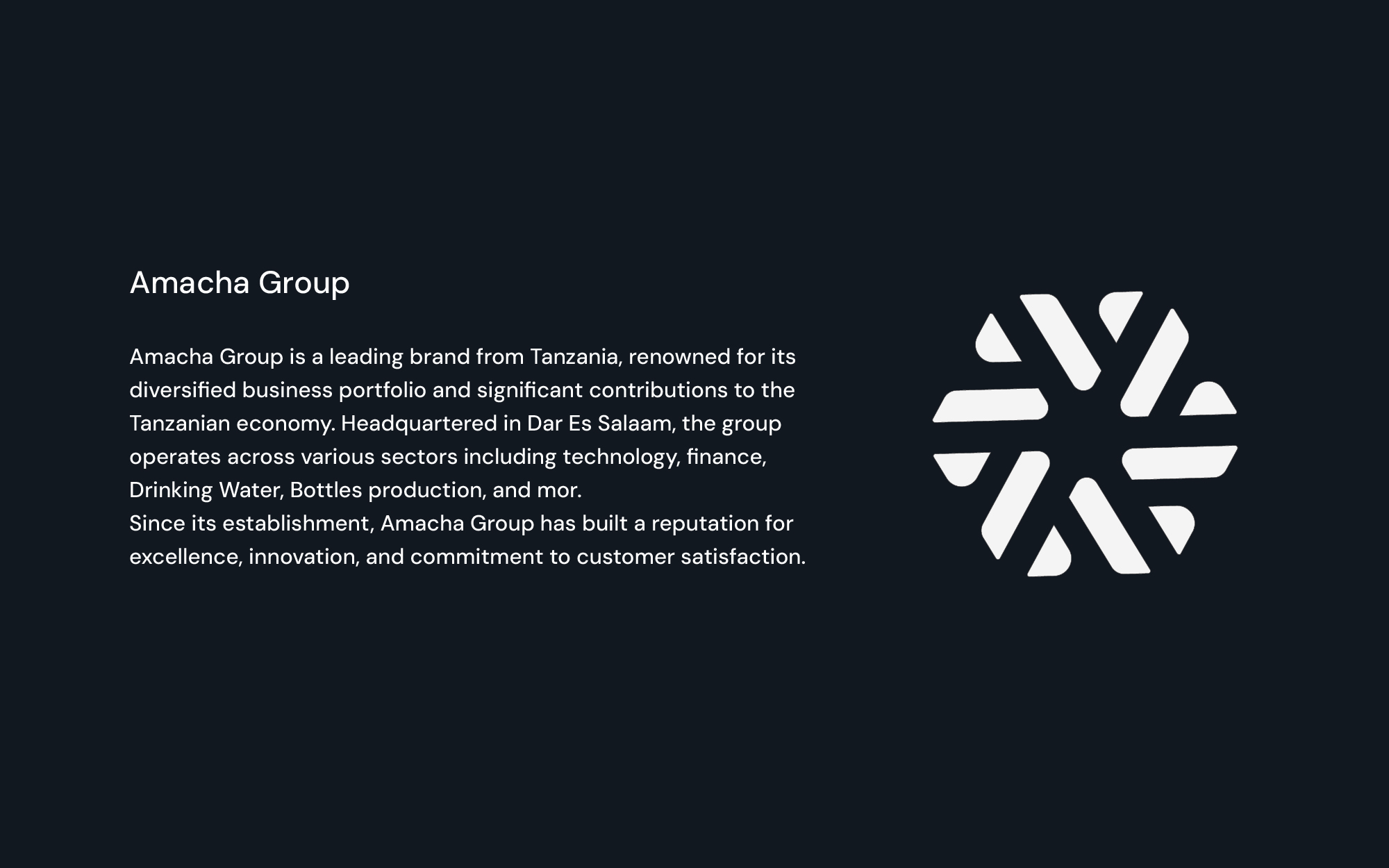
To bring the Amacha Group’s vision to life, I focused on creating a symbol rooted in geometry, symmetry, and meaning. The icon is a dynamic circular mark constructed from angular shapes converging towards the center, symbolizing unity, focus, and collective strength. Each element points inward and outward, visually reflecting the dual essence of receiving divine guidance and radiating impact outward into the community.
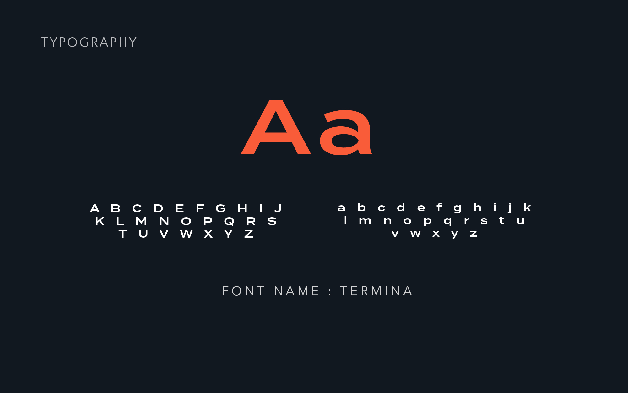
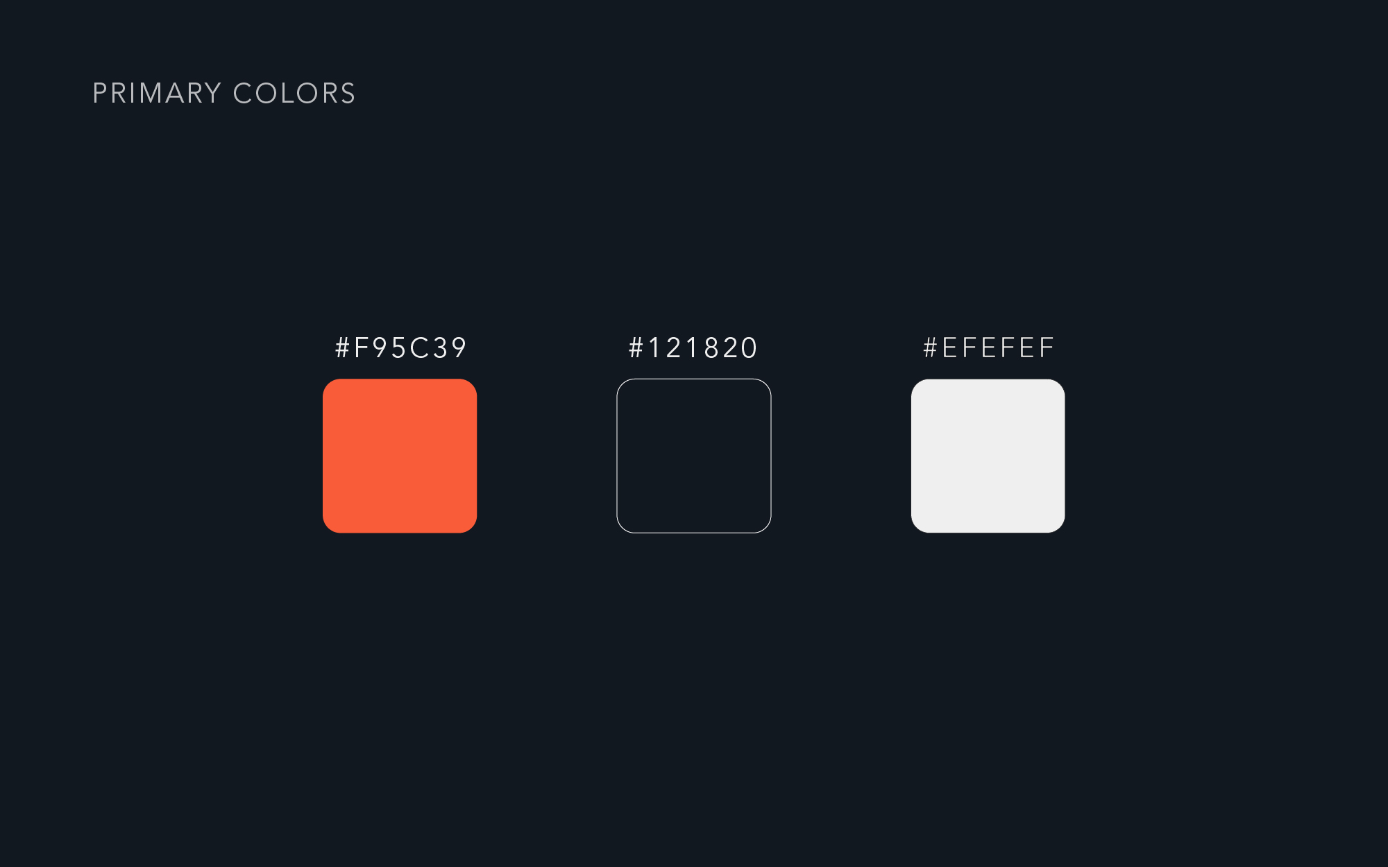
The color palette, a vibrant and confident orange, symbolizes energy, purpose, and modern growth, while the black and white tones add contrast, authority, and timeless balance. The typography is bold and clean, enhancing clarity and strength without losing approachability. The tagline “Kwetu Mungu Kwanza” was given its rightful place beneath the logotype, tying cultural identity and faith directly into the brand’s visual DNA.
Every element was carefully aligned using a geometric grid system to ensure harmony and precision. The result is a logo that is minimal yet full of meaning—a confident emblem of purpose-led leadership with roots in culture, faith, and collective progress.