Project Brief
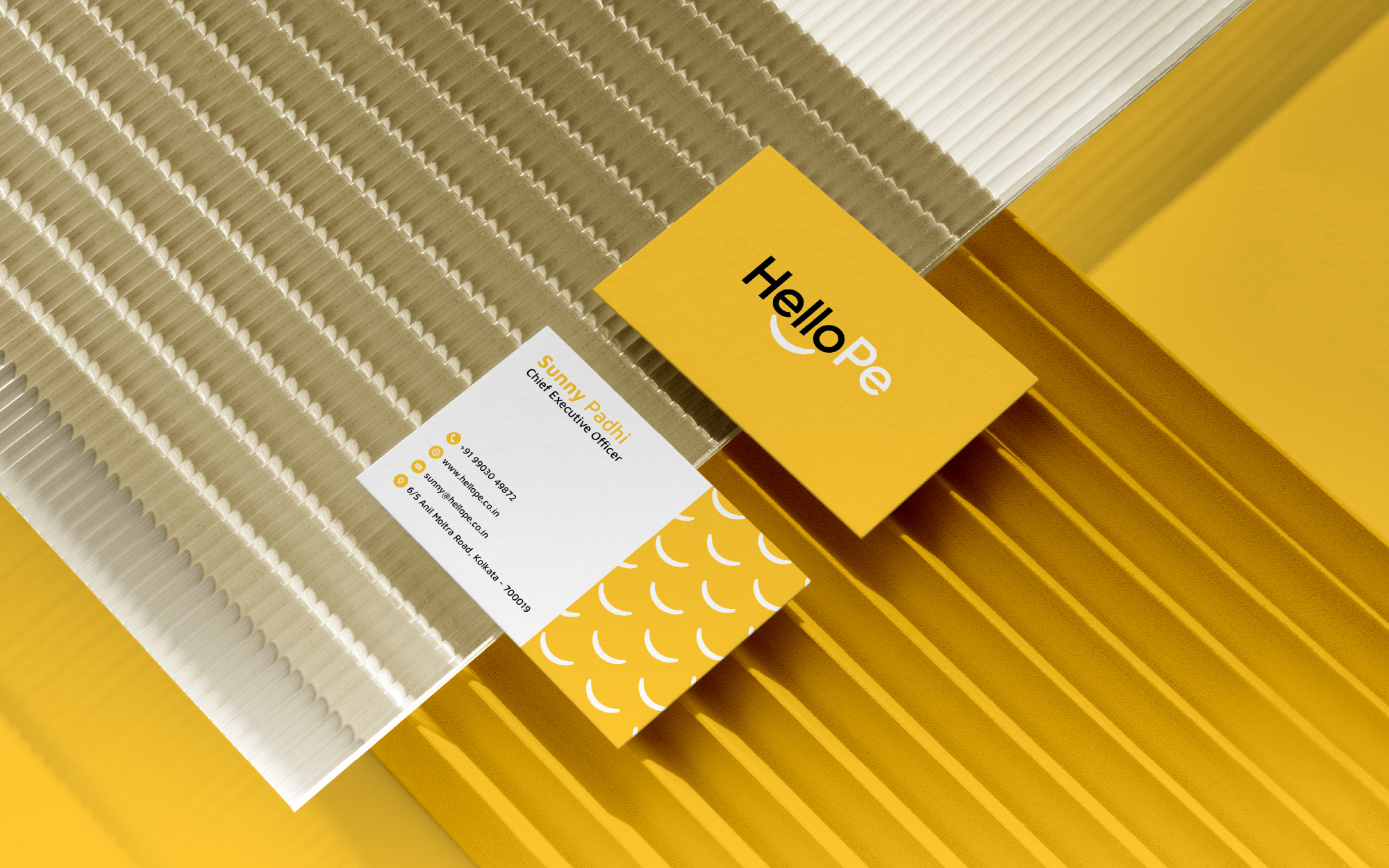
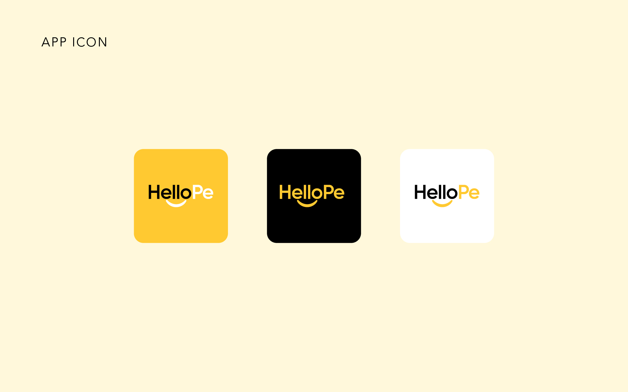
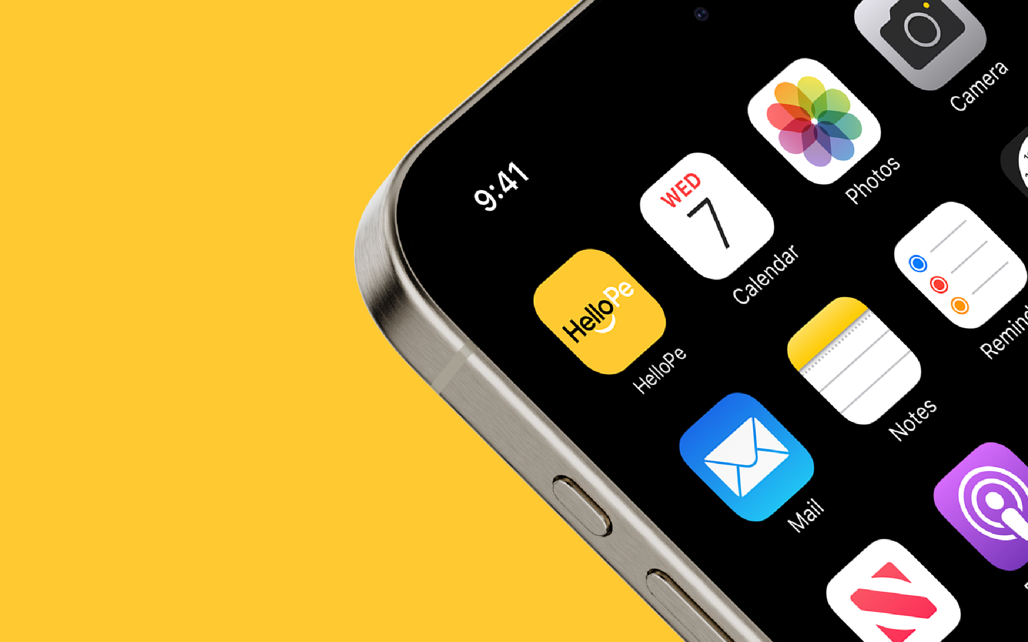
The HelloPe logo is a modern, cheerful, and approachable visual identity designed to communicate friendliness, simplicity, and trust. The name itself is a conversational blend of “Hello” and “Pe” (slang for “people” or "पैसे" in Hindi context), making it instantly relatable in both casual and fintech contexts, especially for an Indian audience
My Approach
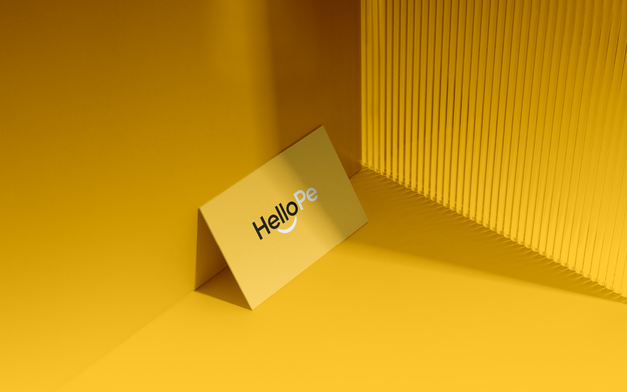
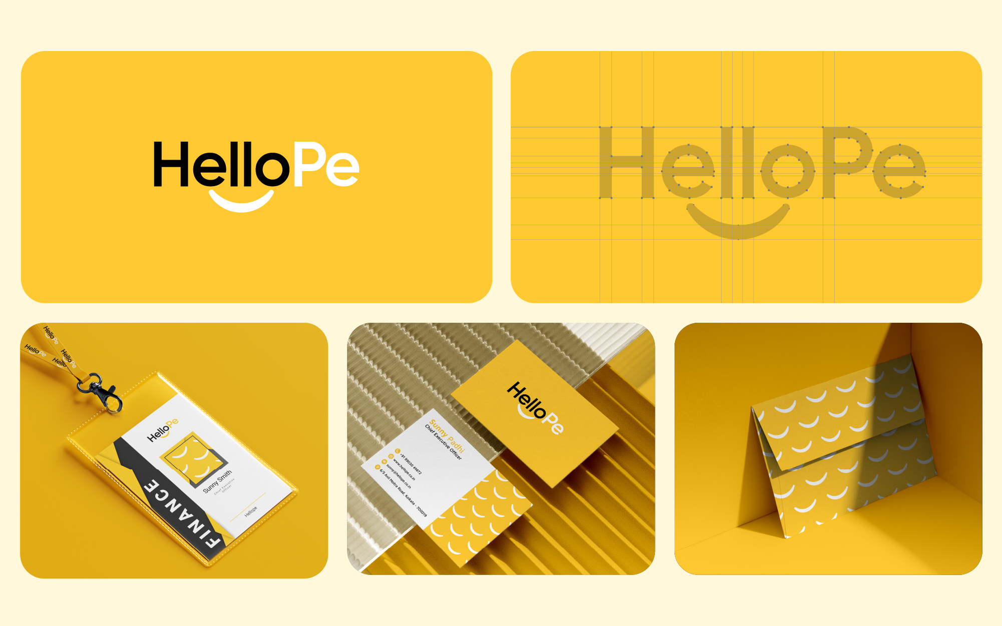
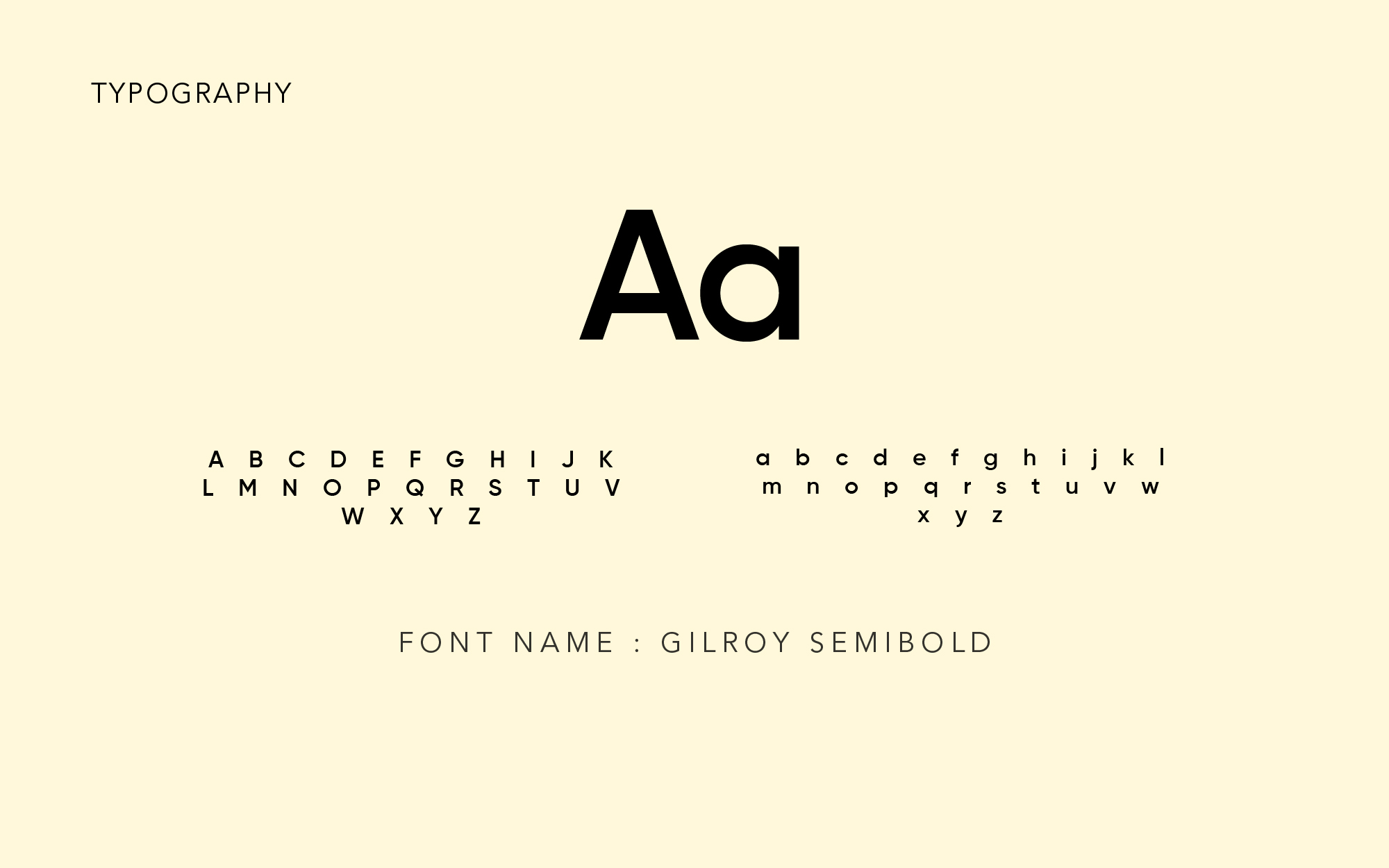
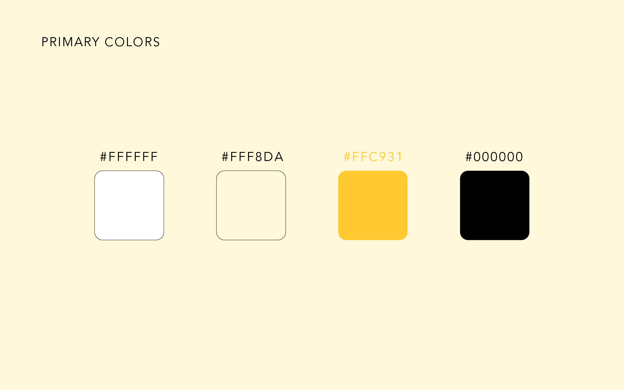
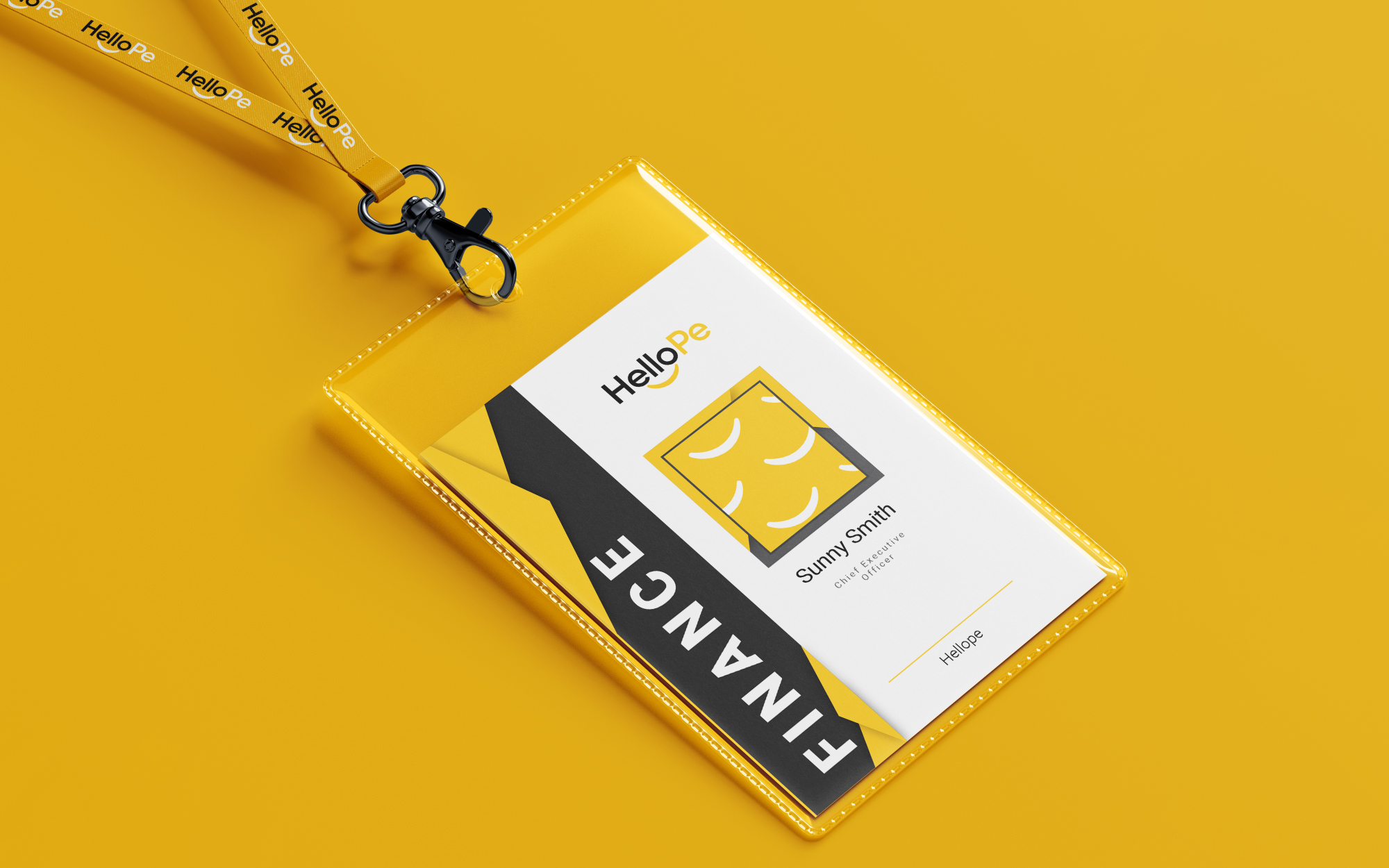
For the HelloPe logo, my approach was to craft a visual identity that feels like a conversation starter—simple, friendly, and emotionally engaging. The name itself blends “Hello” with “Pe,” evoking a casual, human-first tone that's both approachable and rooted in everyday interaction. I incorporated a subtle smile beneath the letters to reinforce a sense of warmth and welcome, turning the wordmark into a cheerful expression rather than just text. The clean, bold typography ensures clarity, while the white-and-yellow color palette adds vibrancy and optimism, creating an instant positive impression. Every element was purposefully designed—minimal, grid-aligned, and versatile—to ensure the brand feels modern and relatable across all touchpoints. For me, design is not just what it looks like, but how it makes people feel—and with HelloPe, I wanted it to feel like a smile in logo form.




Are You Ready To
Get Creative Work ?
Here you can find the frequently asked questions about our service.
